Synthetic users: Emily Cruz, round 3
Site: https://emily-cruz.artist.sovereignweb.site/ (home: Programme). Commit: d5c475f and 99d9f5e. Run: 20 November 2026, about 16:25 UTC, by design.b, on corrected screenshots (see the invalid first run). Look score: 4.0 (4, 4, 4, 4, 4). All five would show it to a friend. The review.
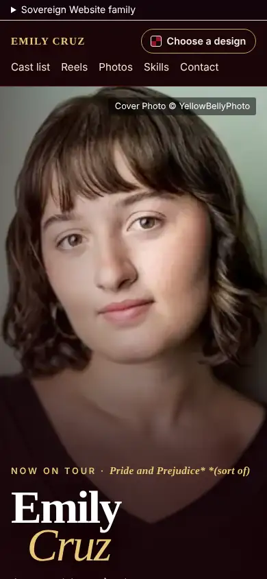
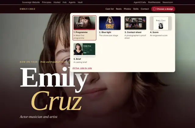
Each persona is a separate agent given only what a visitor gets: the first phone screen (390 x 844), full-page screenshots at 390 and 1366 px in light and dark, the design chooser opened (from round 7 on), and the page's visible text. It is not given the guidelines or design.b's findings. Method: Synthetic users. These are simulations: they inform a rating, and never replace the measured checks or a real person.
Verdicts
Low-vision reader: 4 of 5
"I'd press 'Contact her agent'. It's the red banner right under the photo." "Small, faint credit lines, tiny grey captions and the small gold uppercase labels were hard to read, even zoomed." "The big Emily Cruz name over the portrait made me say wow, though only briefly." Change: larger, higher-contrast credits and captions.
Casting director: 4 of 5
"I would press 'Contact her agent' in the red band under the photo, then check her reels and skills." Trusted the touring credit, named directors and agent. "The credits text is small and dim on dark. Several 'photographs' are reel stills, which feels padded." "The huge Emily Cruz headline over the close-up portrait gave a small wow. The musical skills list is exactly what I need."
Phone visitor in a hurry: 4 of 5
"I would tap 'Contact her agent' near the top, and I found it straight away." "'Pride and Prejudice (sort of)' looked like a typo until I understood it. The mini credit text is small and dim on dark." "The huge serif 'Emily Cruz' over her face made me say 'oh, nice'." Change: brighter credit text, sharper photos.
Design critic: 4 of 5
"The huge serif 'Emily' with gold italic 'Cruz' over the portrait is the wow moment. The rest is tidy but conventional." "The photo grid mixes video stills with portraits at uneven quality." Change: proper stage photography, or consistent crops.
Small business owner: 4 of 5
"I'd click 'Choose a design' and look at the five styles." "I'd show a friend the design picker. The big Emily Cruz name over her face was a small wow. The five looks in one click is the clever bit." Missed a "Get a site like this" button with a price.
Agreed by three or more
- The small credit lines, captions and gold labels read dim (five of five). 2. The photo grid leans on soft video stills (three). 3. "Pride and Prejudice (sort of)" reads like a typo (four); it is the production's own title.
What the personas saw